Colorful infographic with icons for emotions, creativity, learning, community, science, arts, and STEM, connected by a yellow path, symbolizing education and growth.

Designing for curiosity and growth.


A new website and visual identity.

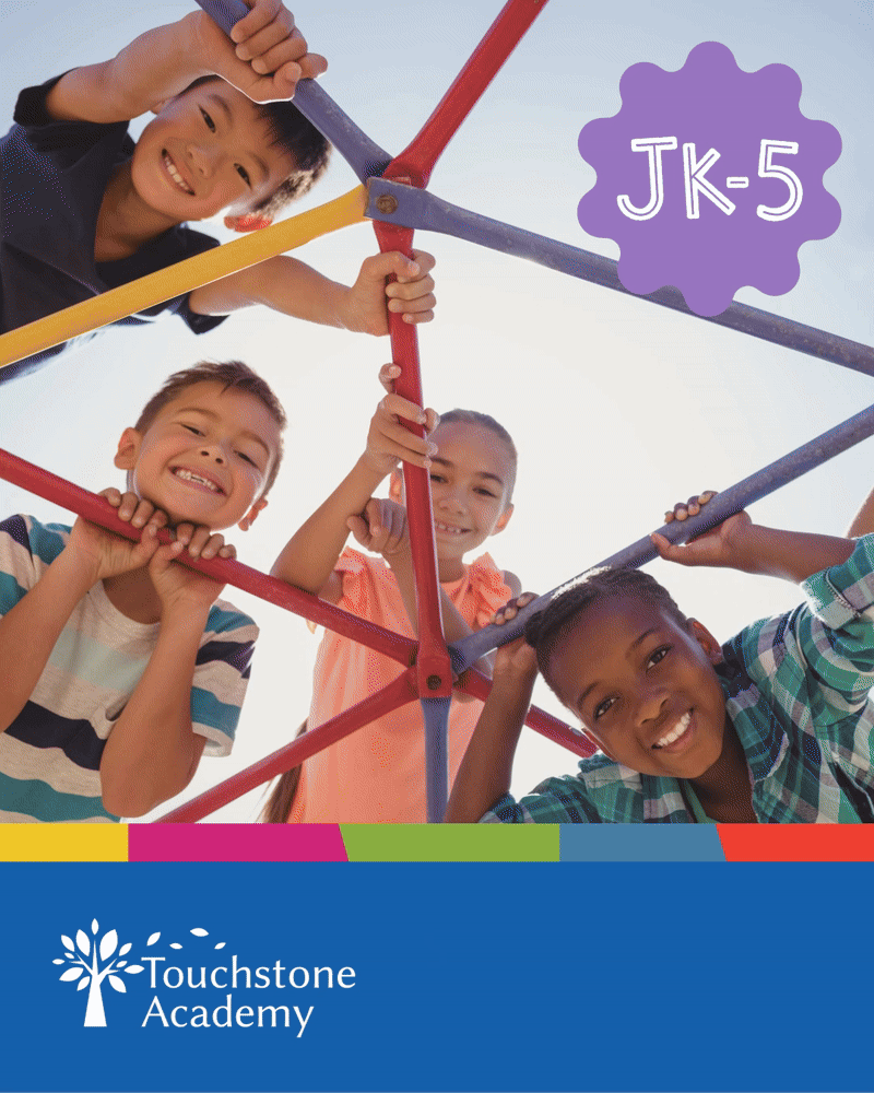
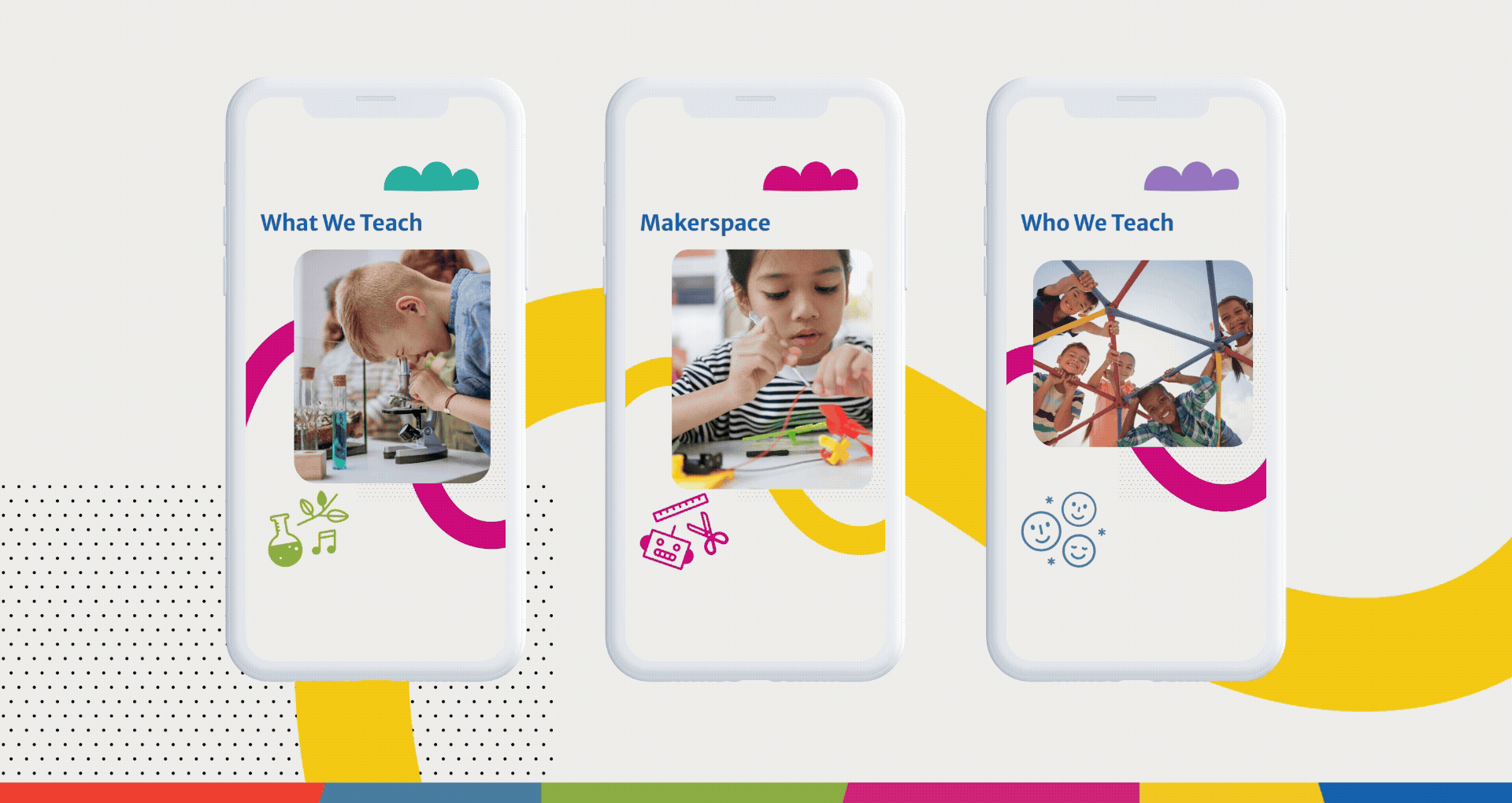
As it approached its 25th anniversary, Touchstone Academy commissioned Stunt Pilot to create a new visual identity and website that better reflected its values: community, curiosity, and academic excellence. Touchstone is an energetic place, with hands-on, active learning and they wanted this better reflected in their brand. Our challenge was to create a cohesive identity system and user-friendly website that would feel approachable for parents, inspiring for students, and legitimize Touchstone Academy within a competitive educational landscape.


Brand Development • Brand Guidelines • Illustration • Animation • Social Media Assets • Website Design & Development • Newsletter Templates • Digital Advertising • Communication Materials

A person in a green dinosaur costume waves their arms with a fun facts badge in the top left corner. 4 Colour blocks create a grid on the right side with stats about the school.
Bright animating educational icons with a Experience the touchstone difference animated type. JK-5 whimsical text appears in a wavy flowe-like shape
Touchstone Academy brochure cover featuring children learning and playing, colorful graphics, and text “Experience the Touchstone Difference” with school details for JK–5, emphasizing small classes and deeper learning.
3 mobile phones with animated graphics appear on a light coloured background. The animation headers are Curriculum, Maker Space and Who we teach. Graphics also include whimsical shapes and images of children doing school activities indoors and outdoo